在 Matplotlib 中绘制直方图中的平均线
matplotlibserver side programmingprogramming更新于 2024/11/21 3:55:00
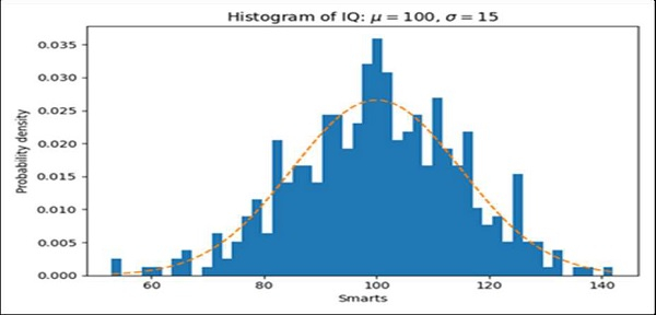
我们可以使用 hist 方法绘制一些表达式。之后,我们将使用 plot 方法和创建 hist 时返回的 bins 绘制表达式的平均图。
步骤
使用一些方程式获取 x 的数据,设置 num_bins = 50。
使用 subplots 方法创建 fig 和 ax 变量,其中默认 nrows 和 ncols 为 1。
使用 ax.hist() 方法获取 n、bins、patches 值。
使用从一些方程式中获得的 bins 和 y 数据绘制平均线。
使用 plt.xlabel() 方法设置 X 轴标签。
使用 plt.ylabel() 方法设置 Y 轴标签。
为轴。
使用tight_layout(),我们可以调整子图之间和周围的填充。
要显示图形,请使用plt.show()方法。
示例
import numpy as np
import matplotlib.pyplot as plt

np.random.seed(19680801)

# 示例数据
mu = 100 # 分布平均值
sigma = 15 # 分布标准差
x = mu + sigma * np.random.randn(437)

num_bins = 50

fig, ax = plt.subplots()

# 数据的直方图
n, bins, patches = ax.hist(x, num_bins, density=True)

# 添加"最佳拟合"线
y = ((1 / (np.sqrt(2 * np.pi) * sigma)) *
np.exp(-0.5 * (1 / sigma * (bins - mu))**2))
ax.plot(bins, y, '--')
ax.set_xlabel('Smarts')
ax.set_ylabel('Probability density')
ax.set_title(r'Histogram of IQ: $\mu=100$, $\sigma=15$')

fig.tight_layout()
plt.show()