在 Matplotlib 中绘制 k-NN 决策边界图
matplotlibpythondata visualization
要在 matplotlib 中绘制 k-NN 决策边界图,我们可以采取以下步骤。
步骤
设置图形大小并调整子图之间和周围的填充。
初始化变量 n_neighbors 以表示邻居的数量。
加载并返回 iris 数据集(分类)。
创建 x 和 y 数据点。
制作深色和浅色列表。
实现 k-最近邻投票的分类器。
创建 xmin、xmax、 ymin 和 ymax 数据点。
创建新图形或激活现有图形。
创建轮廓图。
使用 X 数据集创建散点图。
设置 x 和 y 轴标签、标题和轴刻度。
要显示图形,请使用 Show() 方法。
示例
import numpy as np
import matplotlib.pyplot as plt
import seaborn as sns
from matplotlib.colors import ListedColormap
from sklearn import neighbors, datasets

plt.rcParams["figure.figsize"] = [7.00, 3.50]
plt.rcParams["figure.autolayout"] = True

n_neighbors = 15
iris = datasets.load_iris()
X = iris.data[:, :2]
y = iris.target
h = .02

cmap_light = ListedColormap(['orange', 'cyan', 'cornflowerblue'])
cmap_bold = ['darkorange', 'c', 'darkblue']


clf = neighbors.KNeighborsClassifier(n_neighbors, weights='uniform')
clf.fit(X, y)

x_min, x_max = X[:, 0].min() - 1, X[:, 0].max() + 1
y_min, y_max = X[:, 1].min() - 1, X[:, 1].max() + 1
xx, yy = np.meshgrid(np.arange(x_min, x_max, h),
np.arange(y_min, y_max, h))
Z = clf.predict(np.c_[xx.ravel(), yy.ravel()])
Z = Z.reshape(xx.shape)

plt.figure()

plt.contourf(xx, yy, Z, cmap=cmap_light)

sns.scatterplot(x=X[:, 0], y=X[:, 1], hue=iris.target_names[y],
palette=cmap_bold, alpha=1.0, edgecolor="black")

plt.xlim(xx.min(), xx.max())
plt.ylim(yy.min(), yy.max())

plt.title("3-Class classification (k = %i, 'uniform' = '%s')"
% (n_neighbors, 'uniform'))

plt.xlabel(iris.feature_names[0])
plt.ylabel(iris.feature_names[1])

plt.Show()
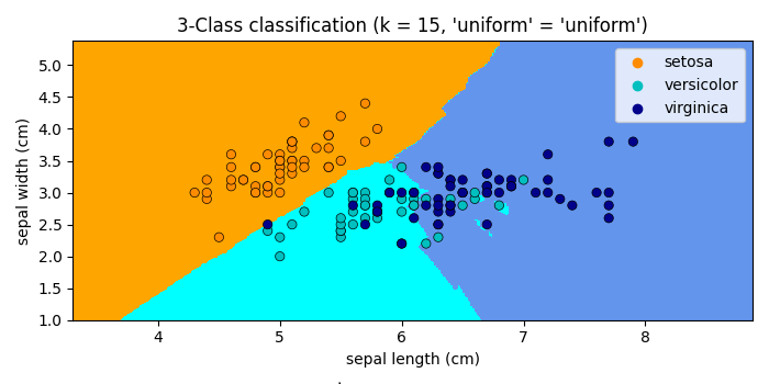
输出
它将产生以下输出 −