如何降低 Matplotlib 中的阴影密度?
matplotlibpythondata visualization
要降低 Matplotlib 中的阴影密度,我们可以采取以下步骤 −
设置图形大小并调整子图之间和周围的填充。
制作自定义水平阴影类以覆盖密度。
附加水平阴影类。
创建新图形或激活现有图形。
将 'ax1' 添加到图形作为子图排列的一部分。
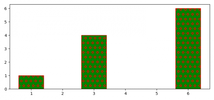
制作数据点列表。
制作带有 x 和 y 数据点的条形图,其中hatch='o', color='green' 和 edgecolor='red'。
要显示图形,请使用 show() 方法。
示例
from matplotlib import pyplot as plt, hatch

plt.rcParams["figure.figsize"] = [7.50, 3.50]
plt.rcParams["figure.autolayout"] = True

class MyHorizontalHatch(hatch.HorizontalHatch):
   def __init__(self, hatch, density):
      char_count = hatch.count('o')
      if char_count > 0:
         self.num_lines = int((1.0 / char_count) * density)
      else:
         self.num_lines = 0
      self.num_vertices = self.num_lines * 2
      super().__init__(hatch, density)

hatch._hatch_types.append(MyHorizontalHatch)

fig = plt.figure()

ax1 = fig.add_subplot(111)

x = [3, 6, 1]
y = [4, 6, 1]

ax1.bar(x, y, color='green', edgecolor='red', hatch="o", lw=1., zorder=0)

plt.show()
输出