如何在 Matplotlib 输出中获得与 LaTex 输出相同的字体?
matplotlibpythondata visualization更新于 2023/12/3 9:28:00
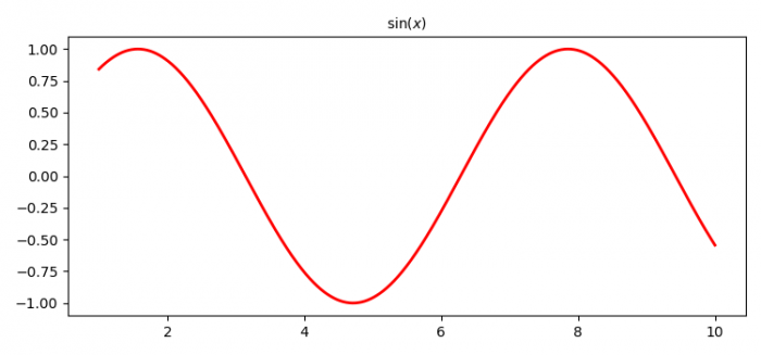
要在 matplotlib 中制作粗体字体粗细的 LaTeX 轴标签,我们可以采取以下步骤−
- 为 x 创建数据点。
- 为 y 创建数据点,即 y=sin(x)。
- 用 LaTex 表示绘制曲线 x 和 y。
- 要激活标签,请使用 legend() 方法。
- 要显示图形,请使用 show() 方法。
示例
import numpy as np
from matplotlib import pyplot as plt, font_manager as fm
fprop = fm.FontProperties(fname='/usr/share/fonts/truetype/malayalam/Karumbi.ttf')
plt.rcParams["figure.figsize"] = [7.50, 3.50]
plt.rcParams["figure.autolayout"] = True
x = np.linspace(1, 10, 1000)
y = np.sin(x)
plt.plot(x, y, label=r'$\sin (x)$', c="red", lw=2)
plt.title(label=r'$\sin (x)$', fontproperties=fprop)
plt.show()
输出