如何在 R 中创建 Y 轴刻度上有间隙的条形图?
r programmingserver side programmingprogramming更新于 2025/4/11 15:37:17
如果我们想在条形图中的 Y 轴刻度上有间隙,那么在基础 R 中是无法做到的。为此,我们可以使用 plotrix 包的 gap.barplot 函数。gap.barplot 函数非常方便,我们只需要使用 gap 参数传递我们想要为其创建条形图的向量和间隙值即可。
加载 plotrix 包:
> library(plotrix)
示例 1
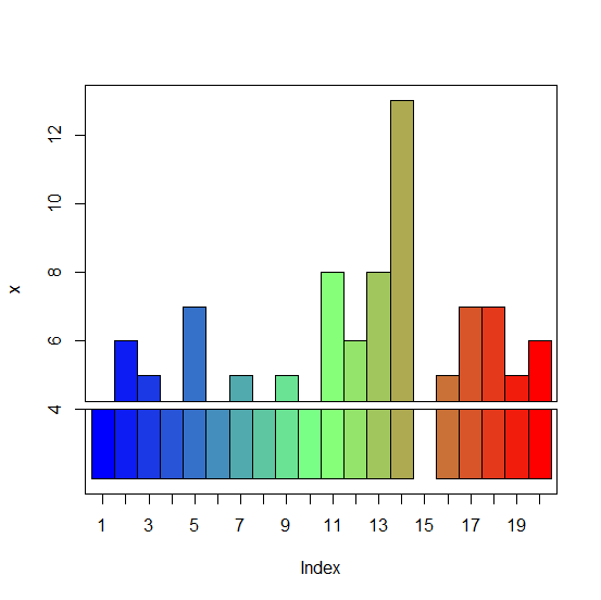
> x<-rpois(20,5)
> x
输出
[1] 2 6 5 4 7 2 5 2 5 2 8 6 8 13 3 5 7 7 5 6
> gap.barplot(x,gap=c(2,4))
ylim 0 11
警告消息:
In gap.barplot(x, gap = c(2, 4)) : gap includes some values of y
输出:
示例2
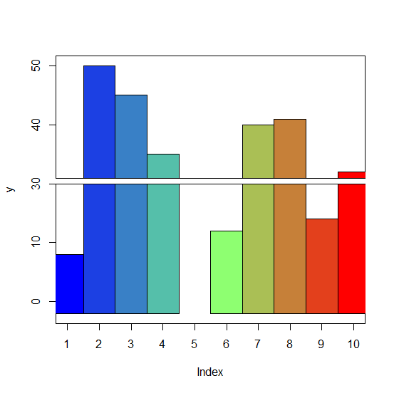
> y<-sample(0:50,10)
> y
输出
[1] 8 50 45 35 25 12 40 41 14 32
> gap.barplot(y,gap=c(20,30))
ylim -2 40
警告消息:
In gap.barplot(y, gap = c(20, 30)) : gap includes some values of y
输出: