如何使用 R 中的 ggplot2 在直方图上显示曲线?
r programmingserver side programmingprogramming更新于 2025/4/10 0:37:17
通常,我们使用直方图来了解变量的分布,但如果我们在直方图上有一条覆盖线,这将使图表更平滑,从而更容易理解变化。要使用 ggplot2 在直方图上显示曲线,我们可以使用 geom_density 函数,其中计数将与直方图的 binwidth 相乘,以便适当地创建密度线。
示例
考虑以下数据框:
> x<-rpois(200,5)
> df<-data.frame(x)
> head(df,20)
输出
   x
1  4
2  5
3  6
4  4
5  9
6  2
7  1
8  5
9  5
10 7
11 6
12 9
13 5
14 2
15 12
16 4
17 8
18 8
19 4
20 3
加载 ggplot2 包并创建直方图:
示例
> library(ggplot2)
> ggplot(df,aes(x))+geom_histogram(binwidth=1.1)
输出:

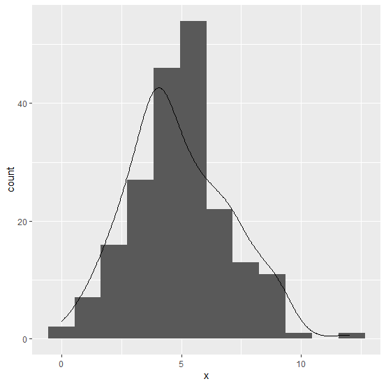
在图形上创建带曲线的直方图:
示例
> ggplot(df,aes(x))+geom_histogram(binwidth=1.1)+geom_density(aes(y=1.1*..count..))
输出: