如何在 R 中使用 ggplot2 创建的条形图中更改图例值?
r programmingserver side programmingprogramming更新于 2025/4/11 14:07:17
如何在 R 中使用 ggplot2 创建的条形图中更改图例值?
默认情况下,图例值被视为使用 ggplot2 包为其创建条形图的分类变量的不同级别,如果我们想更改这些值,则可以使用 ggplot2 包的 scale_color_manual 函数,我们需要在其中传递颜色值和图例值的标签。
示例
考虑以下数据框:
> set.seed(1214)
> x1<-sample(LETTERS[1:4],20,replace=TRUE)
> y1<-rpois(20,5)
> df1<-data.frame(x1,y1)
> df1
输出
  x1 y1
1  B  4
2  B  5
3  C  5
4  C  8
5  A  4
6  B  8
7  C  6
8  C  5
9  C  2
10 A  6
11 A  9
12 D  5
13 D  8
14 D  8
15 B  3
16 D  1
17 D  3
18 D  6
19 D  3
20 C  4
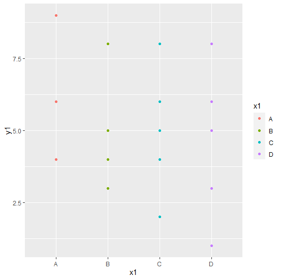
加载 ggplot2 包并为 x1 创建条形图,其中 y1 为频率:
> library(ggplot2)
> ggplot(df1,aes(x1,y1,color=x1))+geom_point()
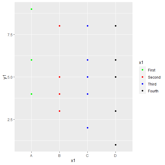
使用不同的图例值创建条形图:
> ggplot(df1,aes(x1,y1,color=x1))+geom_point()+scale_color_manual(values=c("green","red","blue","black"),labels=c("First","Second","Third","Fourth"))
输出: